
Professional Colour Grading Breakdowns
Learning from professional colorists is one of the best ways to improve your own colour grading skills, and this round up of breakdowns from a wide variety of projects and professionals will give you a diverse range of teachers, and technical approaches, to absorb.
The last colour grading breakdown post I put together was pretty popular so you might want to check that out here too.
Colorist Juan Melera produced possibly one of the best colour grading breakdown tutorial videos for the blockbuster look ever, and then didn’t make any more of them for two years. Now he’s back, and in this detailed post, he reverse engineers the grade from Midnight In Paris, and includes a great tip about looking up which film stock the particular film you’re trying to emulate was shot on. His post is well worth a read, and hopefully we won’t have to wait as long till the next one!
Take note of where I placed my video2log conversion. I did this so late in the node graph so that I could do the majority of the work in the image’s original SRGB gamma. When dealing with 8bit images sometimes I find a video2log conversion too early on in the graph can introduce artifacts as you’re pushing the image’s 8bits too hard and then making corrections on top of that.

I found these images breaking down the colour grade on Noah Boambach’s Francis Ha, over on Film Stage and have thrown them together into an animated gif, but you can check out the original stills here. Apparently these stills come from the Criterion release of the film which includes a conversation about the look of the film featuring Pascal Dangin, who did the film’s ‘colour mastering’.
Commercial Colour Grading Breakdown
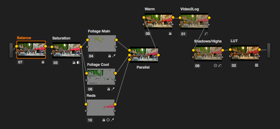
Colorist David Torcivia has been consistently creating great tutorials for Resolve colorists, and in this 18 minute breakdown he dismantles a single shot from a commercial, shot on RED Epic and grading in an ACES project, and shares plenty of tips to improve your grading along the way.
What’s extra nice about this tutorial is that David has also included a camera pointed at his control surface (JL Cooper Eclipse CX) so you can see what he’s doing, as he’s doing it, and every time he uses a keyboard short cut it flashes up in the bottom left of the screen. Small things, that add a lot of value.
More Grading Breakdowns
Spielberg’s colorist Dale Grahn demonstrates the $199 colour grading plugin Koji Advance, available for FCPX, Premiere Pro and After Effects, in this short video in which he emulates the look of Gladiator. You can hear a lot more from Dale on his career in this collection of short videos.
In this short tutorial Dale talks about establishing the time of day in your grade.
Jason Bowdach from Cinetic Studio’s demos Koji Advance inside Premiere Pro in this short tutorial and reviews it in-depth in this blog post
In this grading breakdown from Jason you can see how much work goes into ‘fixing things’ and it’s nice that these vital elements of the projects final polish are included, along side the colour work. You can see the final spot below.
Mathieu Marano, who incidentally has a cool animated intro graphic, reveals the layers in his grade for this music video.
I have previously posted this excellent colour grading breakdown from American Sniper, featuring colorist Maxine Gervais, but it’s basically so good that if you didn’t catch it the first time around, then you need to set 17.35 minutes aside and enjoy a tour of what happens in a feature film grade. Maxine is grading in Baselight and you can read more about her here.
Love the very end of the 3 min take especially. So many power windows! pic.twitter.com/KIK6MGeYDm
— Dan Moran (@DanMoranColor) March 16, 2015
Dan Moran, a colorist at Smoke and Mirrors here in London, shares these images from a recent grade. Be sure to click on them to see a bigger image. Dan is also one of the founders of Mixing Light.com, a colorist training subscription site, where you can learn from professional colorists. Check out my recent review of Mixing Light in this previous post.
Behind the scenes on the Selfridges 3 min one shot job. My timeline for the grade. Invisible dissolves are a must pic.twitter.com/4c5SOJFEAM
— Dan Moran (@DanMoranColor) March 17, 2015
My most complicated node graph then looked like this as it was just for that particular part of the shot. pic.twitter.com/O2R1hargWQ
— Dan Moran (@DanMoranColor) March 17, 2015
Using Colour in Storytelling
I thought it would be helpful to include a couple of videos that articulate just how much colour affects the storytelling process. In this video essay from Lewis Criswell, he seeks to answer the question: “How can colour tell a story?”, the subtle psychological impact of which can’t be underestimated. Well worth a watch and a think!
Similarly, this essay from Robert Mills tracks the same kind of topic – how colour affects storytelling. Robert was inspired to write the post by the use of colour in Oz The Great and Powerful, and examines some interesting ways in which colour, or the lack of it, can shape the narrative. He includes this insightful quote from Director of Photography Roger Deakins.
Black-and-white focuses you on the content and the story, and it really concentrates your attention on what’s in the frame. All too often, color can be a distraction — it’s easier to make color look good, but harder to make color service the story. Black-and-white imagery is much more about the balance between the light and shade in the frame, and I think it can help convey story points a lot better with fewer distractions. – Roger Deakins
Lastly, this supercut of Pixar’s use of colour should give you some visual inspiration! You can find even more colour and storytelling related videos in this previous post.