Making Spider-Man: Into the Spider-Verse
- Inside the Spider-Verse animation techniques
- Editing Spider-Man: Into the Spider-Verse
- Visual breakdowns, behind the scenes featurettes and more!
Spider-Man: Into the Spider-Verse was probably my favourite film of 2018. The stellar combination of creativity, arresting visuals and perfectly timed belly-laughs made it a hit with me, and the rest of the movie-going public. Them and the Academy who have also awarded it an Oscar for Best Animated Feature.
Since I saw the film I’ve been reflecting on just how much there was to love about it, and I could go on, but that’s what the rest of this post is for! A celebration of the filmmakers artistic talents, an examination of their assault on the senses and a closer look into the making of Spider-Man: Into the Spider-Verse.
Buckle up.
Spider-Man: Into the Spider-Verse. A one colon, two hyphen movie title.
Oh and if you only hit one link in this entire post, make sure it’s this one to a huge collection of stunning artwork from various artists who worked on the film over on Kotaku.com. That, and the scratching in the soundtrack section of this post!
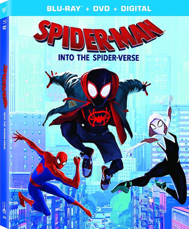
Spider-Man: Into the Spider-Verse Blu-ray Special Features
Fresh off the back of it’s Academy award win for Best Animated Feature, Spider-Man: Into the Spider-Verse can now be your to own on Blu-ray, DVD and digital download.
If you’re always hankering for more special features, commentaries and easter-eggs to enjoy then you won’t be disappointed by this release, which includes:
- Feature commentary with co-writer/producer Phil Lord, producer Chris Miller, co-directors Bob Persichetti and Peter Ramsey, and co-director/co-writer Rodney Rothman.
- We Are Spider-Man
- Spider-verse: A New Dimension
- The Ultimate Comics Cast
- A Tribute to Stan Lee and Steve Ditko
- The Spider-Verse Super-Fan Easter Egg Challenge
- Designing Cinematic Comics Characters
- Heroes and Hams
- Scorpions and Scoundrels
- Alternate Universe Mode
- Lyric Videos
- “Sunflower” by Post Malone and Swae Lee
- “Familia” by Nicki Minaj and Anuel AA (feat. Bantu)
- All-new original short film: “Spider-Ham: Caught In a Ham”
Personally I’m just looking forward to being able to watch it all in slow-motion and freeze frame particularly stunning shots.
Maybe I’ll make it a permanent art-installation in our home, I’m sure my wife won’t mind…
We’ve included everything we learned from the Spider-Man: Into the Spider-Verse Blu-ray below. This includes trivia from the filmmakers commentary and the included Alternate Universe viewing mode, which folds in animatics and “deleted scenes” that offer a whole new angle on the Spider-Verse story.
For a complete breakdown of what you’ll glean from all these special features you can head over to this exceptionally detailed review from Collider.com, although you might just want to sit down and watch it all first!
For a broader collection of the best special features a film editor should watch, check out this previous post.
This new 13 minute breakdown from Wired provides one of the better showcases of the individual elements that went into the film’s unique look, including some new behind the scenes footage that I’ve not seen before in putting this post together!
Animating Spider-Man: Into the Spider-Verse
The film was directed by Bob Persichetti, Peter Ramsey and Rodney Rothman and has now become Sony Animation’s highest grossing animated feature and gone on to win 7 ‘Annie’ awards, which is the animation world’s equivalent of the Oscars, as well as the Golden Globe for Best Animated Feature.
Sweeping all seven categories in which it was nominated and giving the film a prize that has predicted the Oscar animated-feature winner more than 70 percent of the time. – The Wrap.
Here’s hoping it does well on Oscars night too! (Update: it won Best Animated Feature!)
There’s a lot of great information available on the unique creative approach the team took with with crafting the look and feel of their animated feature. In this section I’ve tried to focus mostly on the actual animation itself, with a section below on creating the look of the film more specifically.
In the video above you can see how Adobe’s creative suite of apps were used in the film and why it took nearly 2 years to develop the look of the film.
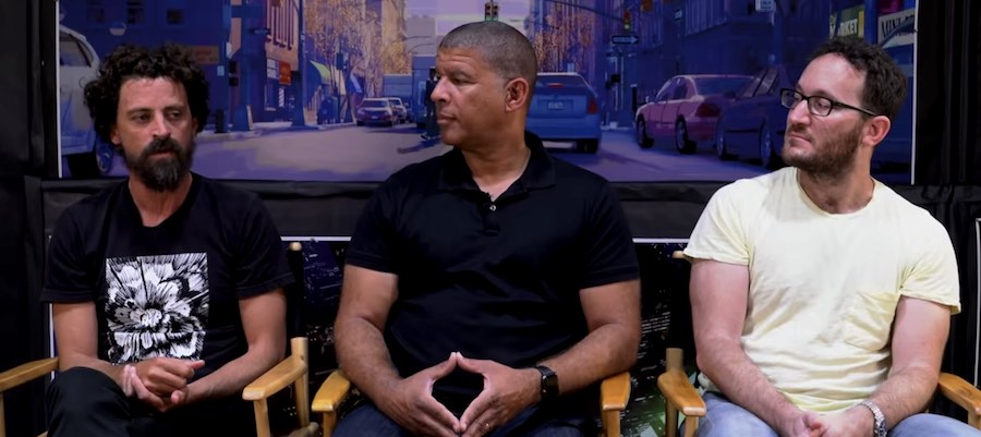
(L-R) Directors Bob Persichetti, Peter Ramsey, and Rodney Rothman.
Before we dive into the animation techniques, it’s worth reading this fantastic article from Animation World Network, which focuses on the fact that the film had three directors onboard and a huge upward climb to finishing the film, as no-one was really sure they could pull it off.
According to Persichetti, doubts about the viability of the project persisted well into the production. “How about a year and a half,” he laughs when sharing how long it took for the team to determine if the film’s unique blend of story and visuals was doable.
“The only stuff we had produced at the point we released that first teaser was what you saw in that first teaser. I will say this…if you step back and look at the period of time, from the release of that teaser to what we had in the final film, you’ll see a giant progression in what we were able to do.
We had all these amazing voice actors, we had all these incredible performances, we had this really human story with a lot of emotionality and we were living in a world that was pretty stylized. But, we were really trying hard to figure out a language that allowed us to have our characters perform in a way that was expressive enough performance-wise, but also visually, to support the subtlety and the weight of Miles’ story. We really painted ourselves into a corner. A wonderful corner, but still, we had to figure it out quickly.
We didn’t have a bunch of early successes that came easy. It was really hard to get a character not in a mask to look right, to move right, and to speak correctly.”
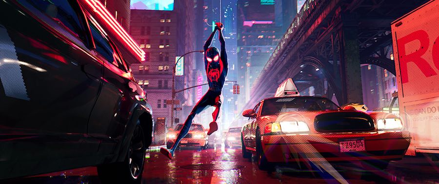
This breakdown from Insider also does a good job of highlighting some of the unique approaches to animating the film that the team took, including animating different characters within the same scene on ‘ones’ and ‘twos’, and creating ‘motion blur’ through bespoke effects, as seen in the poster frame above.
But if you want a much deeper dive into the details of the creative ideas, processes and theory in (pretty much) each and every frame of the teaser trailer, then this analysis of the animation from YouTuber Howard Wimshurst, is worth your time.
It’s mostly his own insights into breaking down several key shots but he does have a lot of interesting things to say, and a fair amount of glee in saying it too!
In this 90 second clip from the film you can hear Miles sing along to Post Malone’s Sunflower and get a sense of the animation, cutting style, cinematography – the whole 9 yards.
In this iconic moment from the film you can watch Miles’ ‘Leap of Faith’ in 4K! Some amazing visuals, editing and animation once again…
Sony was kind enough to make our #Spiderverse script available online. Here it is if you're interested. https://t.co/CO2EQCKdD3
— rodneyrothman (@rodneyrothman) December 29, 2018
You can download the screenplay to the film, written by Phil Lord and Rodney Rothman, direct from Sony to help get you started on this creative odyssey.
??Sequence code name: MRU – Miles Rises Up??
Boards: Alberto Mielgo
Animation: Sungmin Hong, Andrew Hudec, Robin George, Derek Esparza, Kiran Babla @Deweythesecond , Jeff Panko, Emma Cartwright, Philip Rudolph#SpiderVerse #IntoTheSpiderVerse pic.twitter.com/WoNEIKdbbc— Nick Kondo ?? (@NickTyson) January 24, 2019
There are a good number of tweets from animators on the film, sharing some of their test and prep work in comparison to the final shots, which also give you a great insight into the artistry and production process behind each shot.
This animation by Derek Esparza, was one of the first tests done for #SpiderVerse Its focus was exploring different ways to visualize quick motion since the film would not use motion blur. It also went on to serve as the inspiration and foundation of the backstory running shots. pic.twitter.com/2zN9cHlApm
— Nick Kondo ?? (@NickTyson) January 28, 2019
This was by far the most technically challenging shot I animated for #IntoTheSpiderVerse taking ~2 months to finish. As an animator it was really fun to work with all the different animation styles that the characters brought with them from their own universes!#Spiderverse pic.twitter.com/xbkGCvQGFY
— Nick Kondo ?? (@NickTyson) December 16, 2018
I didn’t get much of my #SpiderVerse work released online but I did get to animate this Gwen drumming shot SO! here’s a very long thread about less than two seconds of #IntoTheSpiderVerse pic.twitter.com/yYZH52Nz9B
— Humberto Rosa (@hf_rosa) January 28, 2019
This thread from lead animator Humberto Rosa, has some interesting insights on animating Gwen’s drumming shot.
In this Anatomy of a Scene from The New York Times, you can hear all three directors talk about their collective collaborative process.
Things to notice:
?? Both Miles & Peter are animated on 2's (12 poses/sec), while the scene was rendered on 1's (24 frames/sec). So even though they're frozen for two frames, they are moving within the frame.
?? They are on animated 2's, but offset from each other.
?? Bagel!!! pic.twitter.com/V64n8cRffT— Todd Vaziri (@tvaziri) January 2, 2019
Todd Vaziri has a great thread in these tweets above (and many more – be sure to check them out) on the animation style of the film, which is pretty radically different from recent most animated films.
This #IntoTheSpiderVerse shot animated by Andrew Perez adds a new sound effect to the #SpiderVerse to go alongside??THWIP!??
The scientist is a likeness of Andrew himself, and look at that squash on his head when the bagel impacts ? pic.twitter.com/UGp5qGiMS7
— Nick Kondo ?? (@NickTyson) January 3, 2019
Editing Spider-Man: Into the Spider-Verse
If there’s one place to go for extensive, technically detailed interviews with film editors who are cutting the latest Hollywood blockbusters, it is Steve Hullfish’s Art of The Cut series on Pro Video Coalition. And his interview with Spider-Man: Into the Spider-Verse editor Robert Fisher Jr, does not disappoint.
What’s really different about being the editor on an animated project of this size is how early the editor is involved in the collaborative filmmaking process and how much their input has an impact on the intensely iterative process of creating animation. Steve and Robert cover all of these topics in great detail, as well as covering topics such as:
- maintaining an accessible archive of previous edits
- working with temp music and sound effects
- how you adjust the pacing in an early story animatic
- what it’s like to work so closely with a broader team than just you and the director
It’s a brilliant read and one that reveals the unique challenges an animation editor faces day-in-day-out for two and a half years.
The following quote is a long one, but I think it captures many of these topics in one hit.
FISHER: Before modern animation editing really started it was typical to have very few board panels per minute – which was a very slow editorial pace – so it communicated the basic ideas of the story, but not too much concerning pacing and camera coverage. That was all handled later in the process, in terms of layout and final shot selection and those things.
But now, because storyboards are becoming more and more complete and more complicated — they’re also easier to produce with Photoshop and other programs, so now artists put maybe five boards describing key poses and certain actions where in the past maybe only one.
So a minute-long one-shot scene that has a lot of action, I’ve had boards that have gone up to 500 for a minute sequence.
HULLFISH: Holy cow! That’s like a board every three frames!
FISHER: A few years back — not on this movie — I had 1200 panels describe a big battle sequence, and it was camera moves, it was all connected to other camera moves and it was extremely well drawn and well designed, but it took a long time to find the editorial pace that would support what the artist was trying to do and what the director was intending.
So it has to be a combination of what I can bring to the table, so I have to ask, “Do I really need 1200 boards to describe this action?” Or maybe I could simplify that. Maybe I could do fewer number panels so, in concert with the directors and storyboard people, we would come up with a cut that we would refine — and perhaps maybe the oner didn’t exactly work out the way that they had intended.
So as an editor you can also help define solutions to the problem and say, “Why isn’t this working? Where’s the emphasis? Why did we lose the character in all this activity? What are the character moments that we’re kind of skipping?
And those are the very interesting things that you only get as an animation editor.
Colour Grading Spider-Man: Into the Spider-Verse
To my knowledge, one role that isn’t often discussed in the making of animated feature films is that of the colorist. In this short interview with colorist Natasha Leonnet, over on Post Perspective, you can get a glimpse into the experience of colour grading Spider-Man: Into the Spider-Verse.
The film was colour graded in DaVinci Resolve using an ACES workflow.
They also wanted to bring a certain naturalism to the colour experience. With this particular film, they made very bold choices with their use of colour finishing.
They used an aspect of colour correctors that are used to shift all of the hues and colours; that’s usually reserved for music videos. They completely embraced it.
They were basically using colour finishing to augment the story and refine their hues, especially time of day and progression of the day or night. They used it as their extra lighting step.
Creating the Look of Spider-Man: Into the Spider-Verse
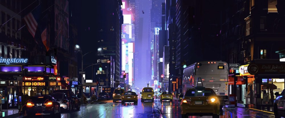
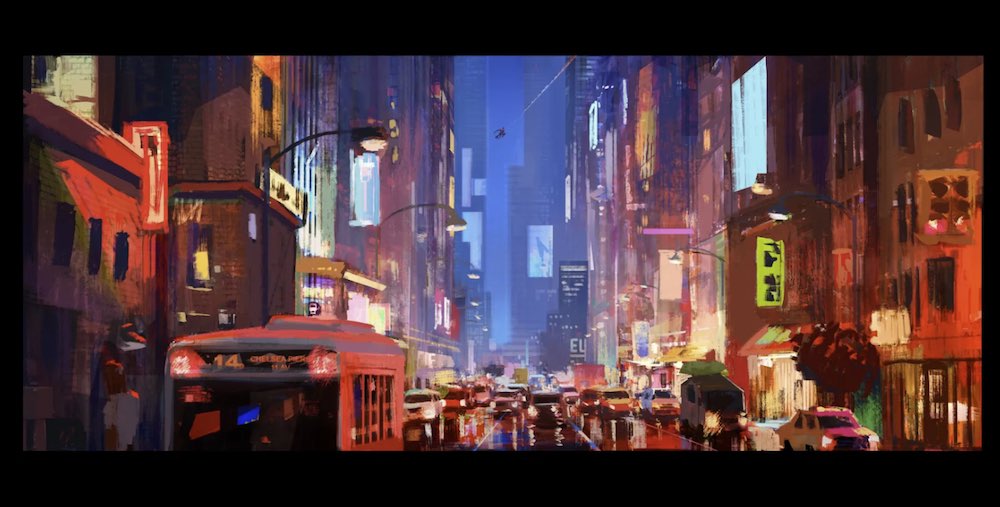
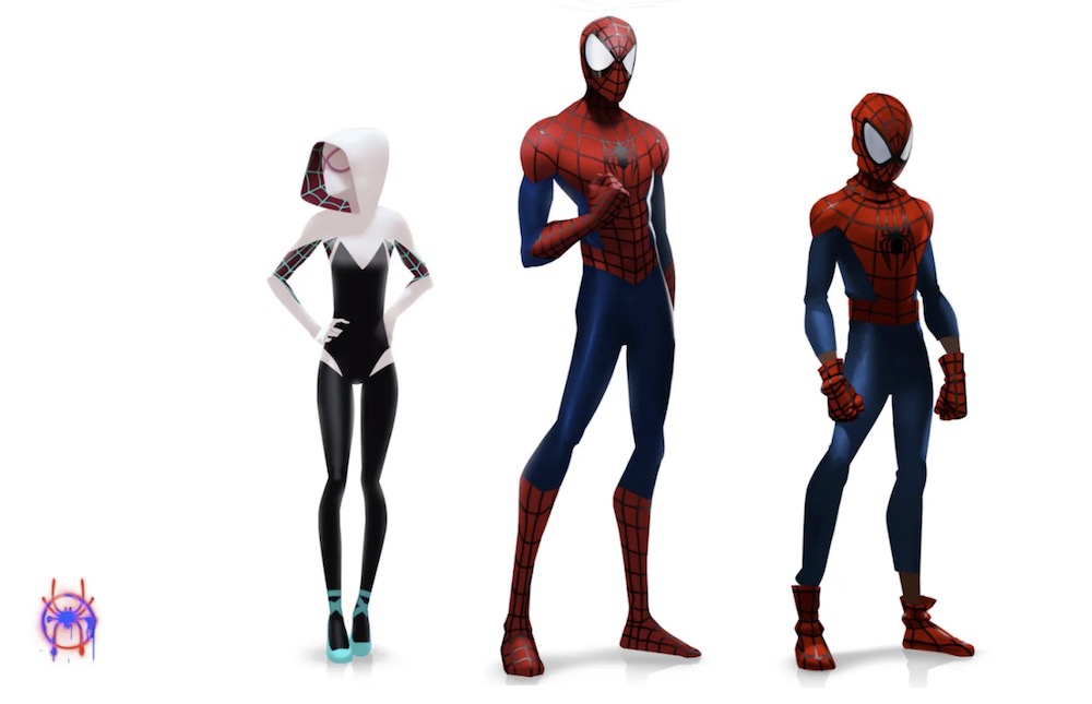
The first stop, and possibly the ‘best’ link in this whole round up is this extensive collection of preparatory artwork from various artists who worked on the film, over on Kotaku.com.
It’s well worth as much time as you can give it, so don’t scroll too fast…
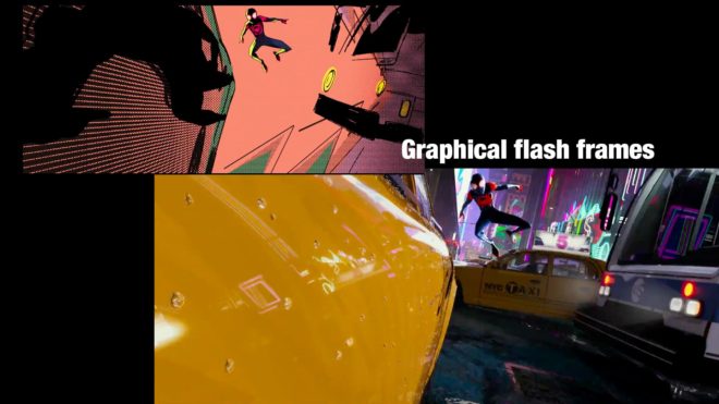
FX Guide has a detailed written breakdown of some of the visual techniques used by the filmmakers to directly emulate the dynamism within the printed page of a comic book, including:
- Misregistration to imply defocus
- Graphic elements – used to fill the frame like “BOOM” and “POW”
- Panelization – breaks up action into panels and the animation frame rate mimics jumping from one panel to the next
- Half-tone dots – to render tone and texture
- Colors – broken down into defined shapes to give them a more illustrative feel
- Hand-drawings – certain effects such as smoke, sparks, and explosions are hand-drawn by the artists
And you can read all about them in this fantastic article by Mike Seymour.
Art director Dean Gordon, who also worked on the two Cloudy movies with Lord and Miller, explains,
“The nature of technology of CG tends to fight a graphic look. We made hand-painted textures, with a level of abstraction to them, that we mapped onto geometry to get a more illustrative feel to our world. We did not want photorealism.
We broke down gradations and colour values into areas and created shorter transitions between them to get a more illustrative feel in the scenes.
We brought the same ideas for the characters’ skin tones. Having the skin tones fit in the same environment and use the same screentones and hatchings we see in comics elevated that comic book look.”
Cartoon Brew has strong interview with CG Supervisor Danny Dimian, on the earliest parts of creating the compelling look of the film, and the subsequent challenges in production.
So, the goal visually was to come up with something new and then have everyone look at everything we do [at Imageworks] in a new light.”
That meant, as far as Imageworks was concerned, a need to break the pipeline anywhere they could, or as Dimian describes, “trying to do something a different way, even if there was no real reason for it. We wanted to change the term, ‘If it’s not broke, don’t fix it’ to, ‘If it’s not broke, break it.’ The goal was to encourage people to experiment and to play in hopes of finding new ideas.”
To get a handle on exactly what they would involve for the production, and particularly at Imageworks, a series of tests shots was embarked upon.
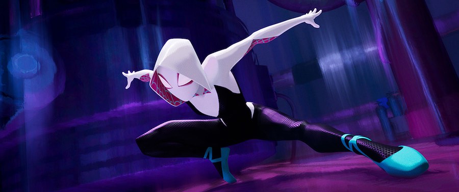
One was a typical Spider-Man shot showing him leaping off a building. Another saw him swinging through the city, and the third was a close-up emotional performance of the character Gwen Stacy.
The latter test shot was especially important for Dimian, especially in terms of how the final non-photorealistic rendering approach would work.
This subway station served as our development sandbox. We used it to experiment with stylized depth of field and motion blur techniques, as well as glows, lens flares and general lighting aesthetics. #SpiderVerse #imageworksvfx pic.twitter.com/hPZ2ej5xsa
— Michael Lasker (@mlasker) December 26, 2018
Michael Lasker was the CG Supervisor for the look of the picture on the film, and in these tweets he shares some interesting thoughts from the journey.
One of the first sequences that we lit, this one gave us the opportunity to master our style and technology. Alan Chen and Geeta Basantani led the lighting and comp, and we pushed the graphic style with silhouettes and simplification in depth. #SpiderVerse #IntoTheSpiderVerse pic.twitter.com/eqOe67LDUO
— Michael Lasker (@mlasker) February 3, 2019
SP//dr had a complex facial rig built so expressions could be animated inside the glass dome and then rendered. He had multiple FX elements simulated for his joint connections, and we studied Manga as inspiration for how to surface his metal. #SpiderVerse #IntoTheSpiderVerse pic.twitter.com/v1AZYnVTMX
— Michael Lasker (@mlasker) January 27, 2019
Kingpin's design was very unique in that most of his form had zero detail, except for his skin and shirt. We created graphic rims to shape his lighting, and applied colored outlines to his jacket lapel based on light direction. #SpiderVerse #intothespiderverse pic.twitter.com/9tRpt7TJOU
— Michael Lasker (@mlasker) January 20, 2019
Graphic reflections and abstract interiors were two major components of our stylized look. We wrote shaders that allowed us to art direct reflective shapes, and layer brush patterns with depth inside thousands of windows. #spiderverse #imageworksvfx #intothespiderverse pic.twitter.com/oVYC8V1N5L
— Michael Lasker (@mlasker) January 12, 2019
Ep. 197 with Spider-Man: Into the Spider-Verse art director @okeefe_artist is live NOW!!!
LISTEN: https://t.co/g2mSCrnmvk
Super stoked to have had the opportunity to speak with Patrick – hope you all enjoy this one as much as we did! pic.twitter.com/4rfxorjBsQ
— THE COLLECTIVE (@thecpodcast) February 11, 2019
This behind the scenes featurette showcases how the creative team used Wacom Cintiq’s as part of their relied upon hardware set up. If you want to learn how you can use a Wacom Cintiq for film editing specifically, check out this massive post featuring detailed interviews with editors Dody Dorn (Memento) and previous Spider-Man movie editor Alan Edward Bell on how they use Cintiq’s day-to-day.
Spider-Man: Into the Spider-Verse Soundtrack
There are two albums available, one with source tracks used in the film, or inspired by the film, and then the actual composed score by Daniel Pemberton.
So – here is how we 'scratched the orchestra' for #Spiderverse. We'd go record and mix all the live players – then get it transferred to 'vinyl' – then spend ages putting the notes back in the mix bar by bar with the amazing @DJBlakeyUk.. pic.twitter.com/5K0cOBmhJ8
— Daniel Pemberton (@DANIELPEMBERTON) December 19, 2018
..I became well-versed in the lingo and variety of scratch styles – 'crab style' 'baby' 'laser cuts' etc – which was helpful in explaining what I wanted to achieve with the scratching from @DJBlakeyUk with each cue…
— Daniel Pemberton (@DANIELPEMBERTON) December 19, 2018
The track below – Catch the S Train – is the track Daniel is referring to in the tweets above, and in this 10-part thread below.
<ONE LAST EPIC #Spiderverse THREAD!> <SCRATCH SPECIAL!!>
1. So a few more scratching vids – Here's @DJBlakey doing some epic 'laser cuts' with some electronics I'd made – we used these over the very opening logos and glitches at the start of the film… pic.twitter.com/BolXB5f7nr— Daniel Pemberton (@DANIELPEMBERTON) December 30, 2018
The whole soundtrack is amazing but my favourite track of all is one you MUST listen to now, Catch The S-Train.
I think this was the first time I introduced my 3-year old daughter (who did not see the movie!) to the idea of scratching. I’m not sure she got it, but hopefully she thought it was cool.
The soundtrack is also available on Amazon Prime’s music service and if you’re after further soundtracks to enjoy, I’d recommend checking out this previous post on my Favourite Film Soundtracks to Work To.
Daniel pitched us this idea when we interviewed him.
We said: would that work?
He said: probably not? Plus it’s prohibitively expensive and needlessly time consuming but that’s what I’d do.
Then he knocked over Peter’s coffee cup and walked out. All true. https://t.co/wFioamYhfC
— rodneyrothman (@rodneyrothman) December 19, 2018
This sounds like the perfect way to handle any pitch meeting.
Re-Creating the Trailer to Spider-Man: Into the Spider-Verse
I think remaking #SpiderMan: Into The #SpiderVerse trailer would be a challenge. A fun challenge where there are scenes with halftone & misprint colors.
— Pinot W. Ichwandardi (@pinot) December 25, 2018
I’ll leave you with this epic thread from Pinot W. Ichwandardi on re-creating the teaser trailer. By hand. With his kids. Amazing.
Be sure to check out the full thread here, but I’ve posted a few highlights below.
Testing with the most interesting scene. It has multiple lighting & shading, the camera is locked. pic.twitter.com/IfT8mwnrqY
— Pinot W. Ichwandardi (@pinot) December 27, 2018
Daughter “I think I just made a mistake.”
Don’t worry kiddo, it’s the beauty of tranditional art. pic.twitter.com/SU9fNEVFc0— Pinot W. Ichwandardi (@pinot) December 27, 2018
Cut 20. One of challenging cut in @SpiderVerse moive with multiplane setup to create camera movement. So far so good. pic.twitter.com/hDVg3knOBd
— Pinot W. Ichwandardi (@pinot) December 29, 2018
In progress: Cut 19
(music: Sunflower by Post Malone & Swae Lee) pic.twitter.com/Ug6NSogFbq— Pinot W. Ichwandardi (@pinot) January 2, 2019

