Better Black and White Colour Grading
There is something about black and white cinematography that simply makes for more captivating images.
This supercut of beautiful black and white cinematography (from Plot Point Productions) inspired me to put together a few sources of inspiration and resources on techniques for better black and white colour grades.
Here’s a shortlist of what is head:
- Black and White Colour Grading Inspiration
- Techniques Beyond De-Saturation
- Using DaVinci Resolve’s Monochrome Mode
- Free Black and White Powergrades
- The Power of Black and White for a Fresh Perspective
- Even more Black and White Color Grading Resources
Obviously to get a good looking black and white grade you need to start with something that’s been well thought through from a set and costume design point of view, prevent your blacks from getting too crushed so you don’t lose all that lovely detail, plus you’ll probably want to throw a little grain on there for some nice texture.
Well, at least, that’s what I’d do. But now to hear from the experts…
Last Update – February 2022
Black and White Colour Grading Inspiration
The following is what happens when Director David Fincher works with cinematographer Mathew Libatique and 5 RED Epic Monochrome camera’s pushed to 3200 ISO on a Justin Timberlake video. It turns out this was edited by Tyler Nelson, Fincher’s long-time first assistant editor.
Pretty stunning. I’m not sure who the colorist was, but Light Iron Digital have credit for the ‘DI’ services.
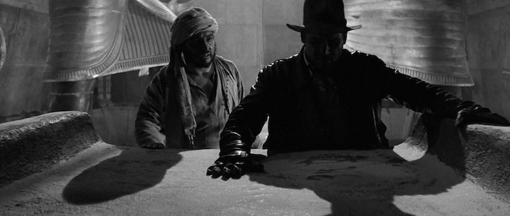
For further inspiration on the benefits of black and white movie viewing you can check out Steven Soderbergh’s version of Raiders of The Lost Ark, in black and white and set to the Social Network soundtrack. You can check out 600+ stills from this version here.
At some point you will say to yourself or someone else, THIS LOOKS AMAZING IN BLACK AND WHITE and it’s because Douglas Slocombe shot The Lavender Hill Mob and the The Servant and his stark, high-contrast lighting style was eye-popping regardless of medium.
Steven Soderbergh
Creating a black and white movie seems to help your Oscar chances, or sometimes just affords you the opportunity to release a second black and white version of the film.
With 10 Oscar win’s between them, both Parasite and Mad Max Fury Road were re-released in black and white versions, and both make for highly enjoyable second viewing experiences.
And while correlation is not causation, black and white Roma also won 3 Oscars and The Artist won 5.
These days it’s not often the case that a black and white film is actually shot in black and white.
For example, Joel Coen’s recent solo directorial effort The Tragedy of Macbeth was originally intended to be shot in black and white, until they needed to make use of blue screens and it was decided that using a colour sensor gave them broader options in post.
We went into the film planning to use the ARRI B&W sensor, but the need for blue screen forced the move to the ARRI colour sensor instead.
Plus, whilst the purity of a purely B&W originated image was appealing, I was concerned that Bruno and Joel would be locked into how the sensor would render the skintones.
And also, that any changes to the image other than tone scale would require roto, which for me worked against the stark and minimal mantra.
Supervising Colorist, Peter Doyle
How To Colour Grade in Black and White
Colorist David Torcivia shares how to tackle a black and white grade in a more nuanced way, in this excellent blog post, whilst also neatly explaining the fundamental difference between a look based on simple desaturation and one based on channel separation.

I would recommend reading and understanding these concepts before diving into any of the other content.
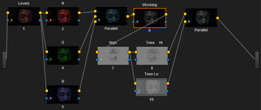
The “Levels” node sets basic levels for the shot before we get to the BW conversion. The meat of the color altering process occurs in the next few parallel nodes.
I split the image into it’s red (R), green (G), and blue (B) channels which gives me individual control over each component’s luminosity (as well as saturation and hue).
I merge these (into the inverted image in Parallel) and apply the proper desaturation to preview individual color channel adjustments.
By manipulating each R, G, and B node, I can gain fine control over the black and white conversion occurring in node 6.
Adjusting lift, gamma, and gain as well as some hue and saturation changes let me separate the colors and tones and produce a vibrant image with proper tone differentiation.
Noam Kroll writing over on Rocketstock.com shares how he likes to approach a black and white grade, including a useful tip about adjusting your white balance and also chooses to remind us of the fundamentals of any good grade at the same time.
- Match your shots first
- You can still adjust your white balance
- Up your contrast
Using DaVinci Resolve’s Monochrome Mode
If you want to make use of Resolve’s Monochrome mode, then this post from Tristan Kneschke demonstrates how to get good results with it.
This is, in effect, a similar way of working to David Torcivia, but simply using Resolve’s mode to do the heavy lifting for you, although you may have a little less ‘finesse’ at your finger tips as a result.
Resolve’s Monochrome mode, emulates the Black and White adjustment layer used in Photoshop.
This preserves the color information underneath and allows us to perform fast moves that give us interesting creative effects.
Alexis Van Hurkman guides you through using the Monochrome effect in DaVinci Resolve in this excellent 3 and half minute tutorial.
This is, in effect, a similar way of working to David Torcivia, but simply using Resolve’s monochrome mode to do the heavy node-lifting for you, although you may have a little less ‘finesse’ at your finger tips as a result.
Free DaVinci Resolve Black and White PowerGrades
Colorist Stefan Ringelschwandtner has done some really nice work reverse engineering the look of numerous popular films over on his site mononodes.com, offering a variety of the resulting DaVinci Resolve PowerGrades for sale and for free.
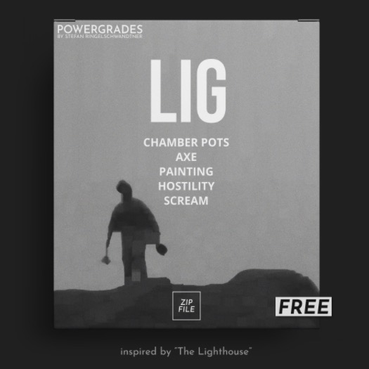
One of those free PowerGrade packs is a set of five looks inspired by The Lighthouse (2019), a black and white indie feature directed by Robert Eggers.
For “The Lighthouse” they used custom filters that emulated early-1900s orthochromatic stock, which was sensitive to ultraviolet, blue and green light, but not red.
Colorist Stefan Ringelschwandtner
You can read more about Stefan’s process, examine several before and after images and see his Resolve node tree for each of the 5 creative looks, here.
Download 5 Free Black and White PowerGrades here.
You can learn more from Stefan as part of this much bigger post on Tools and Training for Pro Colorists, which includes:
- LowePost – Over 3 hours of Free DaVinci Resolve Training
- LowePost – Ravensgrade, a new look tool for Resolve
- Mononodes.com – Reverse Engineered PowerGrades and free downloads
- PixelTools Film Emulation PowerGrades Review (10% off)
- CineMatch 10% Discount Code + 20% off sale = $84 in savings!
- Colorist Kevin Shaw’s Introduction to HDR Training Course
- Introducing fylm.ai – web-based look creation empowered by AI
- Understanding ColourLab AI – the future of colour grading?
- Reverator Texture Tools
See Your Edit With Fresh Eyes in Black and White
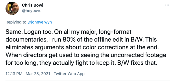
In this interaction I had with editor Chris Bové, he shared a great tip about running your edit in black and white to help keep colour corrections off the table and because it “adds a sexiness to the offline and a vigour to the final-cut stage when colour is re-introduced.“
It also helps to make this change after you’ve been watching it in colour for a while (or vice versa) to help reset your perspective on the edit, because suddenly it all looks new to you.
For more ways to stay fresh to your edit, check out this issue of Cut/daily.
Even More Black and White Colour Grading Resources
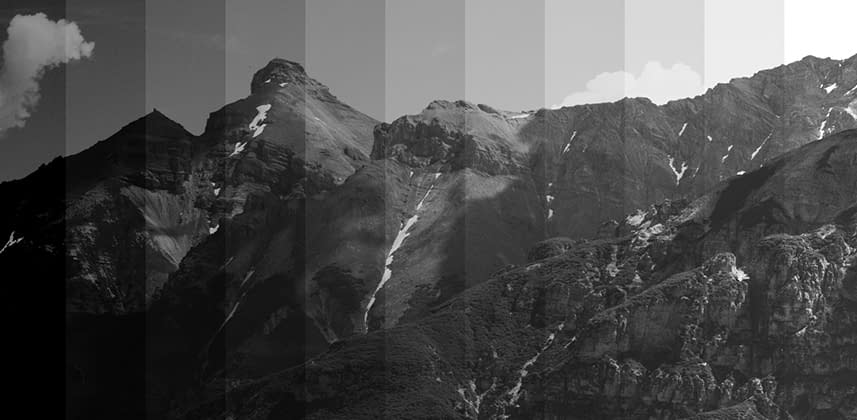
If you’re already a subscriber to MixingLight.com then you’ll want to check out these previous Insights from the past 11 years, which take a much deeper dive into the art and craft of various black and white colour grading looks.
If you’re not an existing subscriber you can sign up for a 7-day free trial here.
- Creating the Classic Black and White Look By Thinking Like A Colorist
- Breaking Down A Black and White Film with a Violet Twist
- Color Correction Looks: Creating Black and White Looks
- Color Grading Challenge – Tri-X Style Black & White
- Look Inspiration – Metallic Monochrome
- Behind The Curtain – Thrice The Grey
- Look Inspiration – Red Filtered B&W
- Look Inspiration – B&W Looks





unfortubnately, it seems David Torcivia’s site is down. that’s a pity, cause his technique inspires me, and only parts of it is included in your article. i would love to see the rest of it!
also, Patrick O’Sullivan’s video is password protected. would be interesting to see that too!