Creating On-Screen Graphics for Hollywood Feature Films
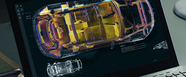
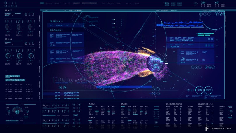
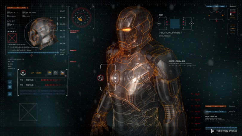
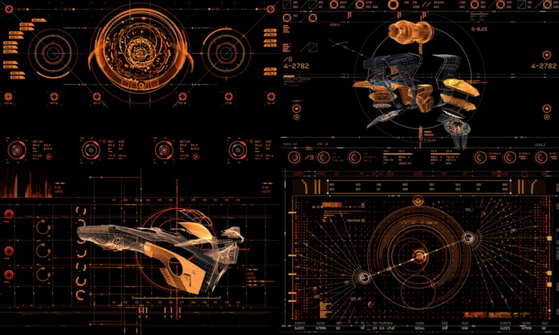
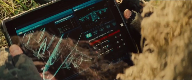
London based Territory Studio produce stunning on-screen graphics for some of Hollywood’s biggest movies, including The Martian, The Avengers: Age of Ultron, Ex-Machina, Guardian’s of The Galaxy and many more.
I sat down with Territory Studio co-founder and creative director, David Sheldon-Hicks for a good long chat about how they pull off such complex creative work, delivered to the exacting standards of some of the world’s top filmmakers and all on time and in budget. Not an easy task to achieve!
There is a process to it, there is a structure, and it’s not that easy to do what we do. For instance, on Avengers, we did a lot of detailed work on that film, but the graphics that people are viewing, which might be a 20 second screen graphic on a loop. That will have been designed and animated in under a day.
So it’s not only producing that quality of work, it’s doing that quality of work under the time pressures that we have here. And our artists are quite unique in that respect.
The creative field of User Interface (UI) design for film and television is a relatively new one, but reflects the way in which our lives are daily becoming ever more saturated in technology, and the interfaces they use. It’s also becoming a vital storytelling mechanism to quickly, and affordably, communicate essential plot points and information to the audience. It will be really interesting to see where this side of the visual effects industry goes in the coming years.
To get a flavour for the extremely high quality, beautiful varied and impressively complex UI graphics Territory Studio create on a regular basis, check out their 2016 UI design reel.
UPDATE – NAB 2016 Presentation
Nik Hill from Territory Studio walks through some of Territory Studio’s work on Avengers: Age of Ultron in this NAB 2016 Adobe booth presentation.
UPDATE 2017 – Interview with Industry Veteran Todd Marks
Vox Magazine has a really interesting video interview with computer/video playback supervisor Todd Marks, an industry veteran in the world of making on-set TVs and screens look real.
It’s a fascinating tour through both the history and complexity of the craft. Check out the video above and the accompanying article for more info.
Take a Course in UI Design for Feature Film
Before we dive into David’s interview, I thought it was worth pointing out a great looking course from LearnSquared.com. The course, UI and Data Design for Film, provides a unique opportunity to learn from highly experienced graphic designer Ash Thorp, and in a totally different way to other online training courses. Ash has worked on films such as Spectre, Dawn of The Planet of The Apes, The Amazing Spiderman 2, Mission Impossible: Rogue Nation, Ender’s Game, Prometheus and many more.
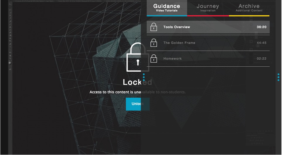
LearnSquared’s approach to online training includes a two month course of video training, homework assignments with direct feedback from the course tutors, and a unique ‘mentorship journey’. Here are some more details from the LearnSquared FAQ…
What do you mean by ‘a new form of art education?’
Each of our courses has not one, but two high-level professionals. You get to follow along as one industry-leading artist teaches another from a completely different field. You receive the same tutorials, the same information, and the same guidance.Why would I want to watch somebody follow tutorials?
We’re not just showing you what we’ve learned – we’re showing you how we learn. By taking an otherwise advanced artist and placing them in an unfamiliar field, they are now starting at square one.
The course on UI and Data Design for Film costs between $100 and $1000 depending on what level of access you purchase, but the $200 course seems to provide the best trade off in terms of price to value, as it includes the ‘mentorship journey’ part of the course. You can check out the eight part’s of the course in detail here.
Setting a benchmark for the visual theme of your project is a vital step of the process. Here, Ash will create the “Golden Frame,” to which all the following frames will work toward. Learn what aspects to focus on, how to manage your time, and knowing when to move on to the next part of the design.
Check out UI and Data Design and other courses like Main Title Design, Narrative Concept Art and more at LearnSquared.com.
Interview with Territory Studio’s Creative Director
Looking at your reel I had presumed that they were all VFX shots, but actually much of what you do is actually delivered to set as part of the production design?
The rough estimate is that about 75% of what we do is delivered on set and about 25% delivered for post, and that varies per film.
On a film like Agent 47 everything was delivered for post and we were working closely with the editor Nicolas De Toth, to figure out all the different plot points that needed to come out in the graphics.
Where as for something like Prometheus, Ridley really wanted everything to be as real as possible, because he was building these huge large-scale sets, and he wanted as many of the graphics as possible to be projected or on screens, in front of the actors so they could react to something, and immerse themselves in that universe.
It’s a bit of a balancing act. Sometimes we’re brought in to do post work because they just didn’t figure out what they wanted to be on that screen before shooting it, or it’s just not possible. If it’s a three dimensional hologram, there isn’t the technology to do that, so we have to do it in post.
Do graphics for film differ from normal UI design, because they’re a storytelling tool?
Graphics for films is definitely becoming more of a consideration, as people understand it now as something you can use in the narrative to tell particular story points.
Ordinarily you’d use a great actor, that would be your preference, second up would be an amazing visual effects shot, but motion graphics can get you there elegantly sometimes, when the other two just don’t make sense.
For instance, an actor could describe the location to the audience, but it wouldn’t make a lot of sense. Or I could create a hugely expensive VFX shot where we rush over the rooftops of London and then go to this other location. Or I could quickly show a map of London and we’re done in three seconds.
It’s the same for all movies, it’s just about streamlining the information and getting the story across quickly, so you can get to the fun bits.
I think graphics, in certain ways, deliver something that other narrative mechanisms can’t. In most instances you’re not going to use motion graphics to tell the entire movie’s story, they’re going to be supplementary, here and there dotted throughout, but they can be really useful.
How do you tackle the challenge of creating something believable whilst also making it clear to the audience what’s going on?
Screens are a reality of today’s life. Everyone works on a computer these days. The tricky thing is making that interesting. Because the reality is we’re writing emails and looking at spreadsheets, and even editing software isn’t particularly riveting to watch in a movie.
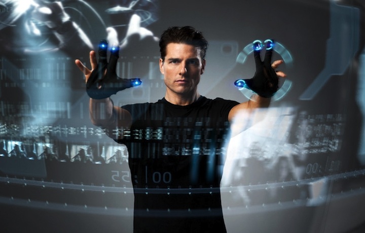
So how do you make technology interactions slightly interesting, or at least aiding the actor’s performance? A great example would be in Minority Report. You’ve got Tom Cruise waving his arms in front of that big glass screen, the director probably was thinking – I need to show him interacting with the system somehow, but it’s going to be god-awful boring if it’s a spreadsheet. No disrespect to software developers, but that’s not great film-viewing pleasure.
So they really thought about a creative mechanism that would connect the actor’s performance with the content on the screen and bring a ballet and a drama to it all. And I think that combination is what we’re looking for in movie UI design.
Some UX designers maybe get a little bit frustrated with the work that we do in films. “Oh, it would never be like that”. I can’t agree with them more. I don’t think the reality of where we’re going with interfaces is in that direction that most films take.
I am highly cynical of the X-box Connect, in that it looks like exercise to me! (laughs)
I don’t feel that waving your arms around is the best way of dealing with a spreadsheet. But in terms of delivering some drama for a movie, it’s fantastic.
And ultimately our brief is to entertain an audience and to deliver a story and not to get in the way of the actors performance. So in that respect it delivers to the brief.
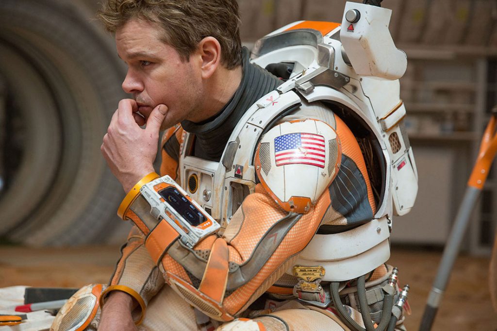
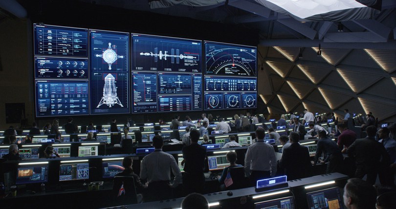
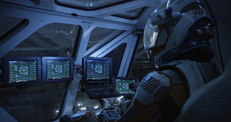
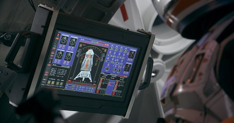
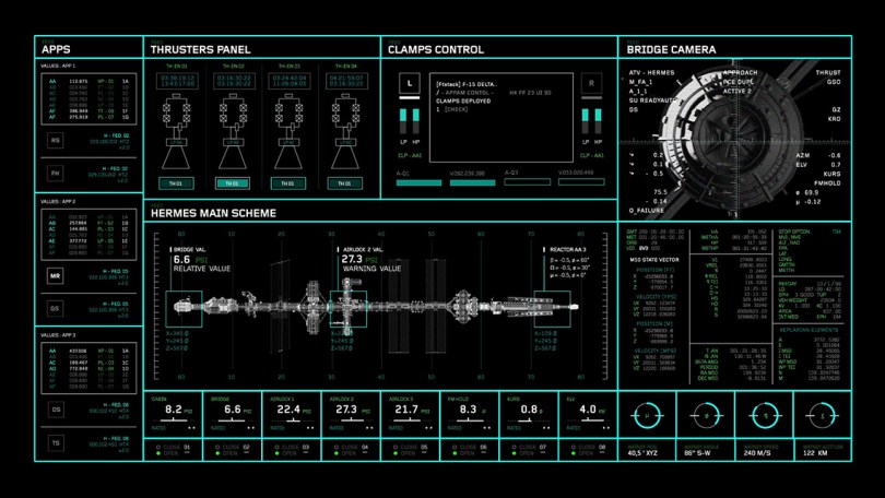
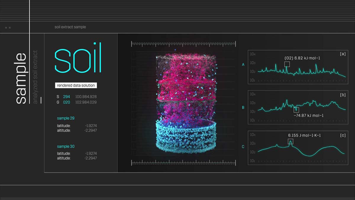
The Martian was a unique one, because the film was dependant upon us believing that this was really near future. So we couldn’t go completely crazy sci-fi with it. It needed to feel like these were real scientists, they were looking at real data, and there was a real problem unfolding. And you needed to believe that these people were bloody clever and they were really struggling to solve this problem.
This meant the data had to be true, so we consulted with NASA engineers, we had them on the phone all the time, we exchanged lots of really long complicated emails, in order to, as best as we could – we’re good designers but not necessarily astrophysicists! – understand what it is that they are looking at and using on their computer screens, every day.
David Lavery at NASA, did a great job of explaining the various different roles of mission control, the sorts of software they would be looking at, the sorts of data they would be interpreting, and then what was important to Ridley to tell the story. So we were a filter between NASA’s reality and what Ridley needed to tell his story.
We weren’t falsifying the information we were just helping Ridley understand what he should be filming at certain points in the movie, to help the audience understand what was going on. And a lot of it was to do with trajectories of spaceship as they slingshot around planets. That was a big deal.
The NASA scientists were really impressed by the original authors research into what they do, and were quite impressed by how much care and attention was made over the science of it all. Even though technology has now updated to the point where there wouldn’t be a communication window.
The way that NASA’s currently charting their R&D projects they predict that in about 15-20 years time they’ll be using a laser technology to communicate directly with the surface of Mars, with very little lag, and no communication window at all. Now that’s great, and in talking to NASA, post the book, that’s a fantastic technological advancement but it completely ruins the story for the film. So in that particular case, we had to stay true to the nature of the book and the narrative takes the lead over any technology improvements.
But, that’s the thing. You have to publish at a certain point, or you have to commit to a film at a certain point but in two years time, once you’ve finished working on the film, technology has moved on. Sometimes you’re releasing graphics or innovations, or uses of technology in a movie, that you think are cutting edge at the time you’re making it, and then Microsoft and Apple have gone and done it in a consumer product by the time the movie’s come out, and you’re behind already.
It’s actually hard to seem futuristic and innovative in a film these days because the tech companies do such a great job of consistently making things better and more impressive all the time.
How do the graphics work on set? How do interactions work with the graphics are they timed or controllable? Is there a clever After Effects project being puppeteered?
It totally depends on the requirements of the shot. We’ll talk to the supervising art director, or set decorator, or whoever is commissioning the work about their needs and what the scripted moments are.
On The Martian we were working with Art Director, Felicity Hickson who did a great job of breaking down the script and listing out all the demands of the film set.
In general we’ll figure out what needs to be a background loop, usually an awful lot of it, and then what moments are specifically scripted.
In those cases can we make do with just a playable QuickTime? Or is there real value in adding interactions here, so for instance, the actor can type in a password and it’s timed in with their performance?
If that happens, we work with a company called Compuhire, who do a great job of taking our QuickTime’s and reverse engineering them by adding control points in their timeline, so that when the actor hits these keystrokes, that happens. They then build that out as a piece of software, and play it back on set in front of the actor. It works really well and it’s so much fun!
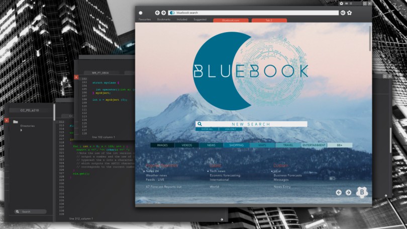
We did a lot of that sort of work for Ex-Machina, because the two main characters’ were programmers. So it felt authentic to Alex Garland to really have them typing away and getting in deep with the code. So we built in a lot of mouse and keyboard interactions for that.
On other movies like Avengers, it’s Robert Downey Jr. moving his hands around in the air, so really most of that is done in post and it’s not an on-set interaction.
And there’s a whole scale in between that. Historically when I’ve worked on Bond movies they’ve always liked interaction because it makes James Bond look quite technically proficient, tapping away at a keyboard.
But a lot of the work that we do is technically displays. For the NASA sets on The Martian, a lot of what they’re doing is looking at the data streaming through and interpreting it themselves, and then making key decisions based on that.
So there’s a range of different deliverables depending on the film, the director and the project requirements.
What’s the most satisfying part of the process for you? How hands-on do you get to be these days?
I’ve not been hand’s on since, Prometheus. Prometheus really launched us. Obviously it had a mixed response, but the production design was sumptuous, and we were very fortunate to be a part of such a visual iconic film, and we ended up doing a lot of other films after that.
I was involved in the design and animation on Prometheus, but post that, the teams’ built up a lot at Territory. We have guys like Marti, Nick, Peter, Sam, Ryan and Daniel and they all are very focused and specialist in this field in a lot of ways.
They will do all of the design and animation and have a lot of the direct conversations with the director or art directors, or production designers or editors, or whoever we’re working with as the project develops.
This means my involvement is more about agreeing the brief, really understanding the story, setting up the right creative references for the team and ensuring they start on the right path.
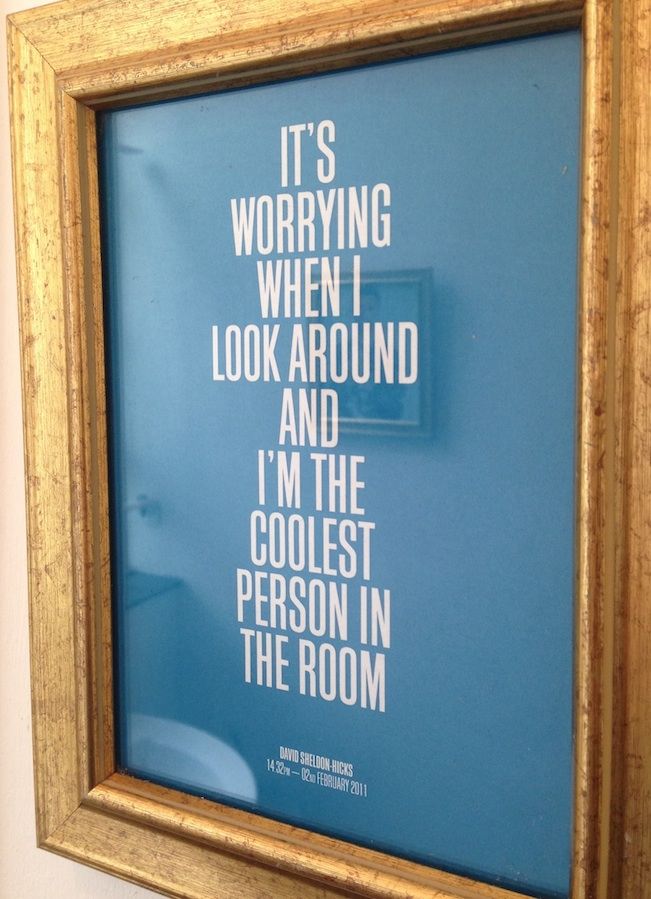
As seen in the Territory bathroom.
I get real enjoyment from helping the team do a great job. They’re all much better than me at doing this kind of work now and so it’s my role to be the communication link between the filmmakers and us. And also making sure we’re delivering all the time!
This is work is quite a specialism and it would be all too easy to produce very similar looking work the whole time. To Joe-public every computer interface looks very similar and so we have to work really hard, for each movie that we work on, to make it feel unique. That becomes a big part of what I do.
With each film project we question our creative process. On Ex-Machina we brought in a code consultant and we let that drive the work. With The Martian we were working directly with NASA and I set up that communication to make sure that we had them on board as consultants the whole way through.
On Avengers, it was a little conversation with Joss Whedon around what can we really do to make this film unique for us? Because some stuff has already been done with Iron Man and He said “I’m really trying to get under the nitty-gritty of the skin of the characters, how can we bring some real-world to this?” So we started crossing real-world references and data with Marvel’s more slick detailed techy-style, and built that up as a fresh new look.
We’re always questioning how we start the project. What’s the kick off point? If we can get that right, and if it’s not based on a Pinterest board or what we’ve seen other people do then, more often than not, it will be true to the nature of the movie and then we’ll have something unique.
That’s the bit that I get really excited about. When I’ve found that unique thing that we can bring to the film that really sets it apart from everyone else’s work.
We’ve got some great competitors, and they’re always pushing us to do better. But I think that is maybe our own unique selling point – that we work in that way.
What’s the usual turn around time on producing a shot?
Timeframe wise, it depends if we’re doing on-set or VFX work. Generally with VFX we can spend anything from three days to two weeks on a shot. It just depends how complicated the shot is.
And it depends on whether we’ve set up the graphic language already. Ordinarily we’d probably spend a month, month and a half, maybe even two months, developing the design look for the film. Creating operating system style guides for each set.
Does each set or location you’re designing for within a film have it’s own style to help the audience locate themselves?
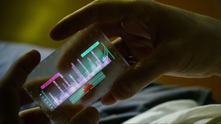
Yes, absolutely. We use colour, typefaces, mood to help people locate themselves in the set. For instance in Prometheus we were going for cyans and magentas in the medical bay, while we were going for cool blues and oranges in engineering, or yellows in the hallways. This way the audience start to get a sense of the colour palette per different area or location.
We’ve done that a lot on our more sci-fi movies, especially Avengers. Obviously you had to have green for the Hulk, that was just a given, but the colour palette had already been set up for Iron man, so we used some of that. We also introduced a new colour palette of fuchsia pinks for a new Dr. Cho character who has a medical background.
We’ll set up the design direction and style guides and then normally there’s a real gear change on a movie where they suddenly change the shoot schedule and everything gets moved forward three weeks. That’s when you get into having to design, animate and deliver one screen a day, per person. Or two, or three, or in the case of The Avengers four!
And we are set up to turn that machine on here. We can suddenly deliver 50-100 screens in a week, if we have to. That is possible only if you’ve correctly laid out your tool kit before you get going.
Does that involve getting lots of freelancers in to crank it out?
We do use freelancers sometimes but it can be tricky because it’s hard to just turn that skill-set on. It’s such a specialist thing, what we do. I’ve seen people try it. They come in thinking ‘oh yeah it’s just loads of details and typography and graphics everywhere’. And they do it, and it just looks like a mess. And it doesn’t look like a computer interface. There’s a real process to the way we work that takes time to learn.
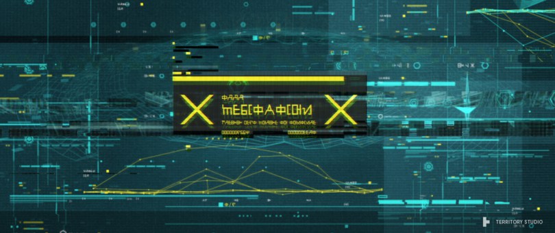
There’s a whole load of different rules and learning’s that we’ve developed over the years to help us produce this kind of work. So on Guardians of the Galaxy, a lot of the interfaces weren’t even English text, they were alien. So you needed to work quite specifically in the formatting of the text to make it still feel like a screen graphic, because you didn’t have any recognisable English letters in there or word constructions that made any sense.
There are definite underlying required skills that mean that we can’t just bring freelancers in off the street. Which is why I’ve had to develop quite a large full time team here, to manage two to three films at any one time.
I don’t think freelancers appreciate our turn around times either. To be thrown in and told “You’ve got half a day to design and animate this shot”, that’s just not going to happen.
The other problem with film is that they won’t accept that it won’t have the finesse. There is no compromise. You have to deliver at the highest standard and you have to do it yesterday. And that is quite a trick.
It’s a mindset that I normally help my full timers get over. Initially they think ‘surely there must be a compromise?’ No there isn’t and the reason there isn’t is because there is a better way. And we talk them through the process of when you lose a project.
Say you’ve been working on a project and for whatever reason you haven’t backed up and suddenly you lose everything. You’ve just done a day’s worth of work that you now need to recreate. When you go back to it you know where your In and Outs are. You know where your A and your B is. It probably takes you a tenth of the time to recreate that project, because there’s been a whole series of procrastinations that were involved in getting there, that are redundant.
When you’re told you have half a day to create something, you spend 10 minutes really, really considering and visualising what that graphic’s going to look like, so that when you come to build it, you get there insanely quickly. And you get there with very clear decision-making and quite confident decision-making because you’ve cut out all the nonsense.
Now it’s not to say that process works for everyone and everything. But in the field that we work in, and because we’ve built up a bunch of tools that allow us to launch at speed, it really bugs everyone, it bugs me! The fact that you can get there that quickly, at that level, it really is possible.
Is your USP then, a really well defined creative process?
It’s knowing that there’s an amount of playtime and that’s scheduled for, but there’s only a certain amount of production time and the gearshift between the two is quite radical.
But it can only happen because that prep time has happened before hand. There’s not much patience on a film set for error, and so we’re delivering today and it needs to be better than all the other films that have come before it. And that intensity is – really focusing! (laughs)
I think questioning your tools and your process the whole way through is one of the best ways to improve your creative workflow.
When I went through design school reading about the Bauhaus school and they were all about questioning their tools, questioning they way they worked and finding new tools along the way. Technology has a much deeper impact on the way that we create, more so than we realise, I think.
My analogy is always photography. It’s like when we were all using 35mm film cameras. If you had 24 shots on the film, you made every shot count because you couldn’t review what you’d taken so there was an act of committing to the shot that meant you self-edited immediately.
You were very aware of focus, you were very aware of exposure, you knew all about depth of field because you had to set the aperture and the shutter speed.
That act of not giving you everything, not giving you ultimate control, actually made you care more about each shot. Now, when we’re taking digital photographs, and I’m certainly guilty of this, we edit now. We think I can take 5-10 shots, I can view it, I can take it again, I can probably Photoshop-it to make it look better.
It’s a very different creative process and act, defined just by the restraining that the toolsets imposed on you. I went to a conference recently where a close friend, Lee Sankey, was doing a talk about interfaces and UX, but he was using musical instruments as his example. And one of the things that came out of that was that musicians really invest time, hard effort, in mastering their interface.
But that’s kind of what gives great music it’s value, the act of creating it is difficult. Everyone talks about a frictionless interface, but I think there’s actually some value in making the user put some effort in, to work hard to master the toolset.
I know Adobe, Avid, Autodesk and all those other guys are doing a great job in designing their interfaces to be as easy to use as possible, but I think there’s maybe some other tools that could be explored that would, not necessarily make it harder to create things, but just challenge us a little bit, and make us re-consider our angle-in, our process a little bit more.
Maybe there’s some more physical interfaces that we could build, maybe bringing physical puppet tools back as inputs for CG animation – that could be really interesting.
Sometimes on a film set we’ll question whether it should it be a digital interface at all or could it be a physical one?
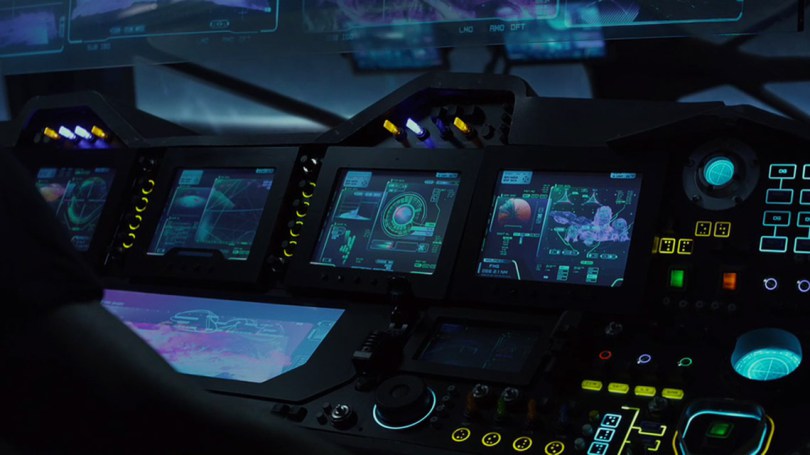
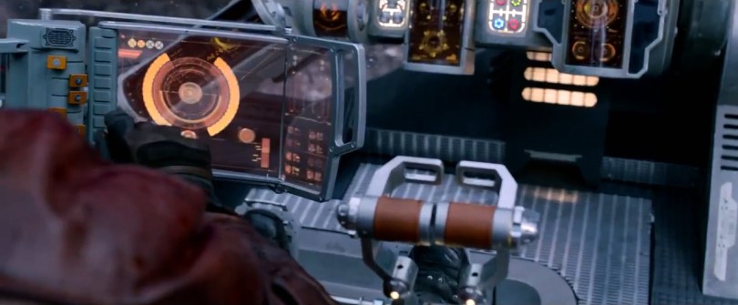
On the Milano (Peter Quill’s spaceship in Guardians of the Galaxy) the key was having a human warmth to the technology, because Peter was a human abducted as a child, so a lot of his human references were from the 80s. All worn soft leathers and scratched up metal, so there was a real emotional connection to the materiality of it.
Talking to the production design and art directors saying; let’s not do it as a graphic, lets do some cool dials or knobs, and levers and things, so that the characters can have a physical connection with it, that they can move stuff around. A bit like Han Solo on the Millennium Falcon they can knock it around a little bit and try and kick it into action and all that sort of thing.
I think it’s about connecting people with the things that we use again, in a slightly different way. I don’t know if you have that with edit suites – do you yearn for control desks again?
Yes and no, it depends. It’s great being in a real colour grading suite with the big control desk with all the buttons and dials and the ‘orbs’ to put your hands on, as it’s all so tactile but when that’s transferred to an iPad app, its just the not the same. With editing I use a Wacom tablet all the time, partly to stave off RSI but mostly because it’s more fun to use a pen than a mouse.
You’ve just said it there – it’s more fun for me. I’ll enjoy doing it more and that will change the outcome because I’ve actually enjoyed working on this.
All of our interfaces are becoming more glassy and frictionless but is that the world that we want to live in? Maybe there will be a reaction to that and we’ll see people injecting a bit of personality, emotional connection and some kind of authentic human touches that I think are really important.
Are our tech-saturated lives changing the way we understand interfaces in film?
That’s interesting. Directors often see our work as not only a statement on the future, especially if it’s a sci-fi movie, of where we’re heading. But kind of charting back from that, if that’s a statement on where we’re heading it’s probably also a statement on where we are now. So we should be questioning, is that really the trajectory we want to go on?
Bladerunner was amazing for me because it built out this really quite realistic universe. Which is what a lot of directors are doing – building worlds, universes – that ask questions of where we are heading.
Initially when I started doing interfaces for films I don’t think anyone was thinking that deeply about it. But as technology has become such a huge part of our lives and so embedded in the mainstream consciousness, we have a right to question how to connect with it, how we’re using it, where are we going.
It’s interesting, reflecting of that. I don’t think that I am intellect in that respect, but I can see that my work is picking up on some of those notes, that are going on under the surface.
In conversations with directors I come to understand the deeper themes that they’re thinking around or with costume designers, and production designers, they really think in detail about every little moment in the film.
They think about the weight of a material, or why it reflects light in that way. Or how it will cast a shadow, and what that means for an actors performance, or what it says about the movie.
I think our fast passes at screen graphics, in the early years, was quite surface-based. I think we’re starting to, as a profession in motion graphics, really think deeply around the meaning there, and the statements that it’s making.
There needs to be deeper thought going on around what we’re saying about technology and how that fits into movies, storytelling, and the overall director comment. Why have they made this movie, what are they saying, what is this movie or TV show actually for?
And therefore, is our graphic supporting that? That becomes really interesting and that gives life, for me, to the whole profession. I’m not just the guy who does his little geeky thing. It actually becomes broader and more interesting.
What wisdom can you share with the artists reading this, to help them improve their creative process?
I think if we can all be film directors, that’s not a bad place to start. To be envisioning our own little worlds.
If I direct a shoot, I will – usually in the bath – try and imagine the entire thing in my head. When I’ve spoken to directors, they’ve got every single piece there. But the hardest bit is actually just trying to tease it out. In working with someone like Ridley, the threads and textures were complex, so you’d meander these intricate thoughts to find the parts pertinent to our work. The absolute dynamite piece of information you needed – that will set the project on fire.
Nolan was very economic with his descriptions. It should be this, this and this. And you’d know immediately and there would be no questions in your mind.
Other directors pull from references and pull different things in and allow you to bring your own expression to it. They’d give you some boundaries to work within and then just set you going. Almost always they’ve got an image in their head, but they’re open to it being improved. The baseline is their idea but if you can elevate that, even better.
So I think every creative having a really clear vision for where they want to go, is crucial. It’s too easy to just go quickly to the tools, but if you can get a vision firmly planted in your head, then when you’re using the tools, you’re not thinking about chucking on plugins, that you don’t need, or trying out this little thing or playing around with that.
And don’t get me wrong, I do love happy accidents, I just think that, going back to the photography thing of really taking the time to consider the moment, before you take the picture. That’s something that isn’t quite happening using current technology in the creative process, and I think if we can all just take a moment – it can be really quite powerful.
And the next piece of advice is fail fast.
You need to get so strong with your toolset that you get to the execution quickly, so you can realise that it’s just not working. That way you can have another ten ideas and another ten mistakes, but through those ten mistakes you will get to much more solid idea.
If you only make one mistake, and you’re presenting idea number two to the client, that’s only idea number two. If you can get it to idea ten or twenty the work will be in a much stronger place.
And filmmakers know that. They’ll almost never accept your first delivery. Even if it was probably the best thing they’ve ever seen. They know if they make a comment on it and push you even further, it will be better next time around.
People are very good at seeing that there is a problem. They’re not always good at knowing why that is. It’s a gut feel. We all know when something looks really cool – but we can’t tell you why.
I think it’s a designer’s job, to say, you know what you were right. This isn’t working but I’m going to propose these different solutions. I’m going to try that solution, no, that didn’t work. I’m going to try that solution, no OK that didn’t work. Just keep accepting that failure is actually a great learning process and to be ok with that. Just don’t present it to the client!
That’s true, rarely does anyone analyse their success but everyone looks back at problems to figure out what went wrong, because you have to. What else is important to creating high quality work?
It’s all about decision making. It’s about good taste, good references. It’s all the history that you bring to a project. It comes down to the people.
People and environment, I think environment is often understated. If you can give people a good environment to create in, they’ll do better work. That’s maybe my role here too, that I can give them the space and the protection to do good work.
It’s much harder to have focus on a project if you’re constantly being interrupted by email, social media etc. and I think it’s really important for creative people to filter that out for a good chunk of their day. Just so they can focus and make good decisions, and realise they’re failing.
You know just taking the time to notice, this has gone wrong. Why has this gone wrong? hmmm that’s interesting.
As a kid I really loved my own time. Sitting down with sketchbooks whiling away the hours. And I yearn for that a little bit now. But it’s my role to make sure everyone else is able to sit with their sketchbook and spend the time with it, to find out where things are going wrong. Finding those problems quickly and solving them, quickly.
When we worked with Chris McQuarrie on Mission impossible, he would always pick us up on ways in which the technology or the graphics could help him tell the story or make it funny.
He wanted the technology to be really frustrating to use, so that, for example, when Benji’s trying to hack the plane, trying to find his way through some Russian software, he doesn’t know what the hell he’s doing. Chris wanted a really annoying UX experience that helped him tell the story. But once he’d got that in place, when it came to the aesthetics of it, the design of it, the mechanics of it, he was just like – “but that’s what you guys do. Why am I going to tell you how to do that?”
And when I first came to movies, I thought that they would tell me what typeface to use, what colour palette, where the pixels were going – everything. But really they’re like – my bits the story – everything else is you guys. If you’re chosen for this movie, I expect that you are good enough to do what you do, really, really well. So you’d better do that because they completely trust you to deliver that.
That level of trust means a lot to the people who are working on films like these. It also puts a lot of pressure on them too. “OK, this is going up on a big cinema screen in front of millions of people, I’d better not mess this up.”
Empowering people to take more creative decisions, to self-direct and to take on the project themselves, and not to handhold – just makes for better creatives.
I’ll have my creative team having direct conversations with the director, or the editor or the VFX supervisor, because they don’t need Chinese whispers in between via me. Secondly I want everyone to feel that they’re not a software operator – they’re the ones having direct conversations with the person who’s making the movie, and they feel responsible to the scenes, or the shots, that they’re working on.
That way they have a real personal investment, they really care. Too often as a business owner, or head of department, or whatever you feel as though you’re part of that chain of command, and sometimes you end up getting in the way.
Most of the time it’s just about helping the flow of information, helping the person working with you to understand how they need to communicate to the people above you, and just reminding them that they need to keep that communication going. It doesn’t need to be any more hands on than that.

