More Interviews with Film Colorists
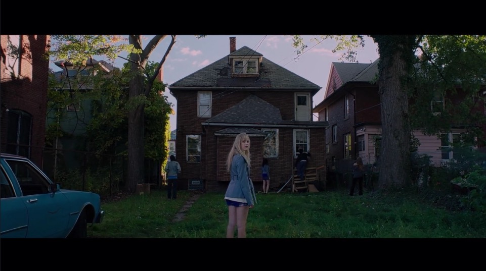
Image from Mark Todd Osborne’s Reel
When it comes to learning more about the business and craft of being a full-time film colorist, there’s never been more resources available to you than today.
In this post I’ve rounded up some of the best places to hear from professional colorists working in industry covering a wide range of feature film, TV, commercial and documentary projects.
It’s been about 10 months since my last post on Interviews with Colorists, but it’s still well worth revisiting for several handfuls of video interviews with experienced colorists, like this one from Mike Cosola.
People aren’t paying for you to own the equipment, what they’re paying for is your expertise and your talent as a colorist. And that’s really what I sell.
I don’t sell the fact that I know how to run the Baselight. I sell the fact that I know what a good picture looks like.
So you don’t have to be in the industry to develop that talent, but you do have to be in a certain position to start working with clients. It’s one thing to know how to do this. It’s one thing to know how to do this in the time allotted. And that’s a whole different thing.
Premiumbeat Colorist Interviews

Colorist Colin Travers – Airbnb TVC
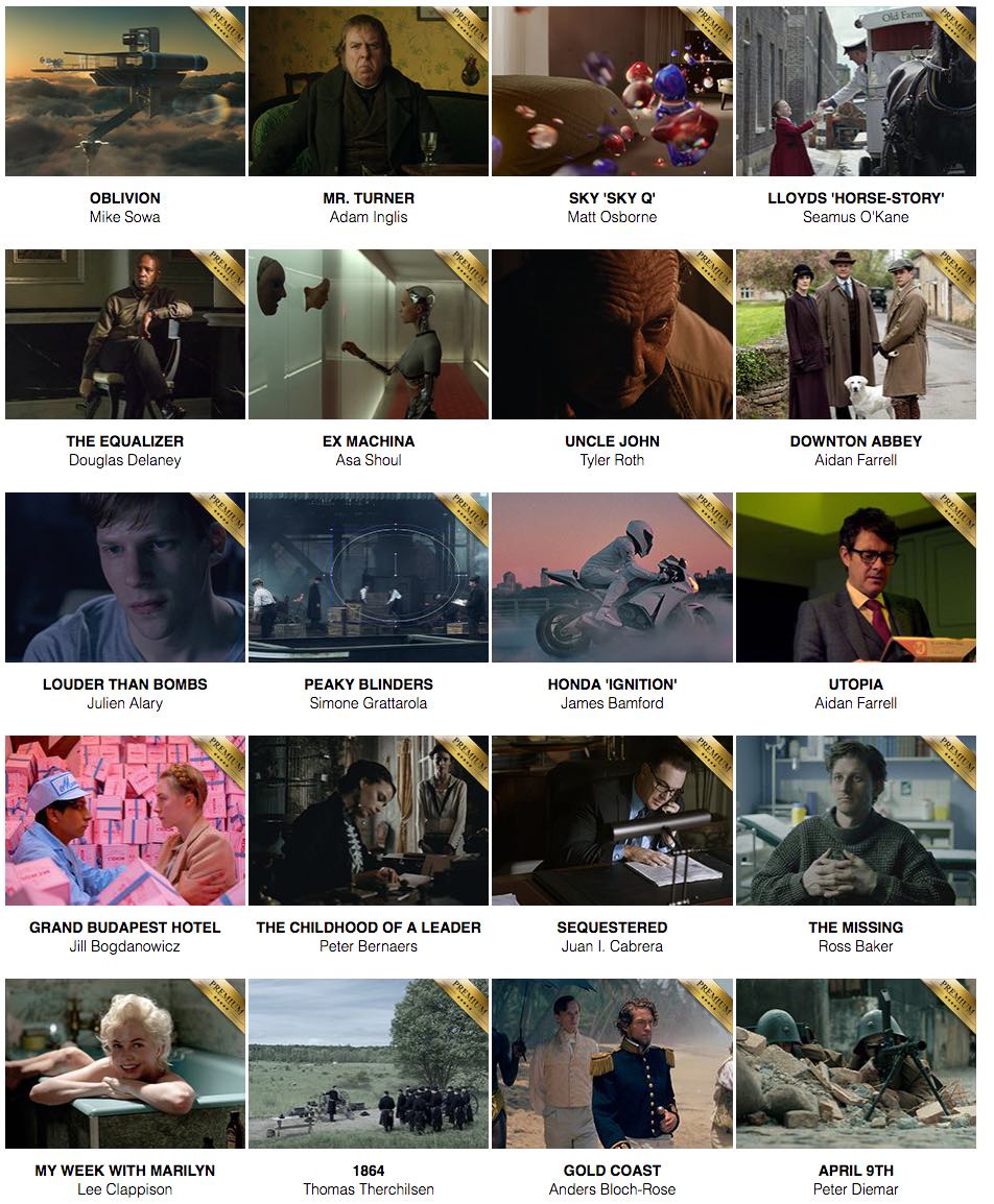
For a growing collection of interviews with working colorists, head over to Premiumbeat.com and take the time to rummage through the following gems provided by Tristan Kneschke.
- Colorist Colin Travers
- Colorist Rob Bessette
- Colorist Patrick Inhofer
- Colorist Alexis Van Hurkman
- Colorist Mark Todd Osbourne
Maybe the exact tool you’ll pull up for a project may vary, but I think of things in a multi-pass workflow. All colorists work in a very particular order, it’s just when you get to a certain level of craftsmanship, it’ll all start to meld together.
The three-pass workflow is especially good for, say, editors short on time. If you’re coloring a twenty-minute program, the worst thing that can happen is that you make the first ten minutes look awesome and the last ten looking like crud. I wouldn’t consider that acceptable.
This quote from colorist and Mixing Light founder Patrick Inhofer is a good example of the kind of practical tips you can pick up throughout the series. Each interview varies on the topics covered which means you’ll definitely benefit from reading them all!
I recently reviewed Patrick’s Advanced DaVinci Resolve Training course, which covers the ‘three-pass workflow’ he mentions here, in a lot of detail.
Dealing with a lot of different personalities over the years, I’ve learned to deal with the room, whose voice to listen to and how to roll with the punches. Some places are really good with printing out names of everyone in the session, letting you know who to watch out for, who’s calling the shots.
Color is a language. For clients who haven’t been to many color sessions, it’s about getting the verbiage down. “Too hot” might actually mean “too bright.” “Too grey” could mean “not enough contrast” or “not enough saturation.
There are many different skills to master as a working colorist and handling a room full of clients is one that only experience can teach you. However, freelance colorist Colin Travers shares some helpful insights in his Premiumbeat.com interview.
Budgets definitely run the gamut. We see a lot of high-end broadcast work, but there’s a lot of web content too. People are pushing a lot of social media work now. Instagram is blowing up with video content and advertising. Whereas Instagram used to contain more user-sourced content, there’s a lot more commercial content on there now.
Colorist Rob Bessette shares some helpful industry insights in his Premiumbeat interview and is also the subject of a further article which gives you a guided tour inside Rob’s colour grading suite, thanks to Cinematography Database.
https://www.youtube.com/watch?v=OJvuEAMHvbI
Lowepost Colorist Community Review
Lowe Post free content
The brand new Lowepost colorist community site is a valuable addition to any colorist’s reading list.
Where as once you might have subscribed to a monthly industry print magazine, these days you’re probably best of investing in sites like Mixing Light and Lowepost.
The former will keep your practical training needs covered, whilst the later will inspire and inform with craft insights from industry leading colorists.
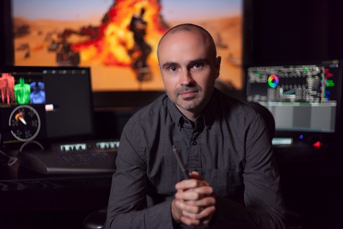
One of the toughest parts of Fury Road for me was working out the right look for the Day-For-Night. The incredible Cinematographer, John Seale and VFX Supervisor, Andrew Jackson had worked out a technique of shooting 2 stops over-exposed on the day shoot. The theory behind this is quite simple.
With an over-exposed image (without clipping highlights), we can expose the shot back down in the colour suite, grade the image to create the Night Blue look. Then we can selectively bring out any detail from the shadows that we wish, with virtually no noise.
This enabled me to create very graphic contrasty images with detail exactly where I wanted it, and a fall off into shadows where I didn’t want it. Almost every D4N shot was basically roto’d and had the sky replaced to create the look. It took a few months of fiddly work, but I think the look is different and graphic.
Each article on the site is written by a supervising colorist, senior colorist or scientist from a major studios themselves, which means that you’re getting direct access to that colorist’s brain without any intermediary.
This means the content is both technically detailed and packed with helpful insights, like in this quote (above) from Mad Max Fury Road colorist Eric Whipp’s recollections of the grade. (For an extensive round up on the making of Mad Max Fury Road, check out this previous post.)
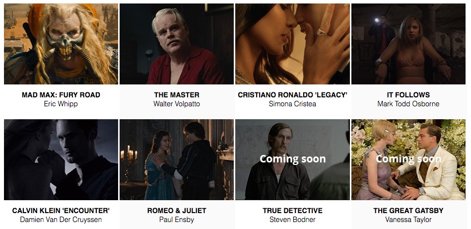
There are several free articles to check out with freelance colorist Mark Todd Osbourne’s article on It Follows and Walter Volpatto’s thoughts on his grade for The Master, being particularly worth reading.
But to access the premium content – currently a further 34 articles on the site and about as many yet as unreleased – you’ll need to subscribe for $49 a year.
This is pretty decent value at just $4 a month, which gets you instant access to all the other parts of the site including the ability to chat privately with other members and make use of exclusive discounts on products like Assimilate Scratch, Cinegrain film grain packs and look presets. You also get access to some free LUTS.
There are a also several free technical articles on LUTS, Printer Lights, Log Data and Film Colour Timing but you’ll need to register (or free) to read these and comment in the forums.
The forums feature many of the common technical and software specific topics colorists tend to dive into, as well as some helpful discussions on creating specific looks and thoughts on tackling difficult shots.
But, to my mind, what you’re really paying for are the in-depth case studies and, having had a look at some of the premium content, there’s some really fantastic stuff in there with much more to come!
For me, skin tone is the absolute most important thing in the frame. Once I get the skin right, everything else seems to fall into place. I generally like a warm, yellowish glow for most skin types. But since this film had a dark, ominous look to it, it was more appropriate to let skin tones go a little bit more “rosy” than I normally would. It did fit the atmosphere of the film. – Mark Todd Osbourne
Mike Sowa’s breakdown of the grade for Oblivion is rich in technical details but includes interesting anecdotes like how by his beginning by working on the trailer, it provided a chance to create looks for the whole film in a ‘mini-film’.
Dale E. Grahn’s description of colour timing Saving Private Ryan provides a fascinating look into the complex art of film print colour timing.
Andreas Minuth’s walk through of his grade on Hollywood action-comedy Big Game, is peppered with before and after stills which help to illustrate his comments and reveal some useful tips.
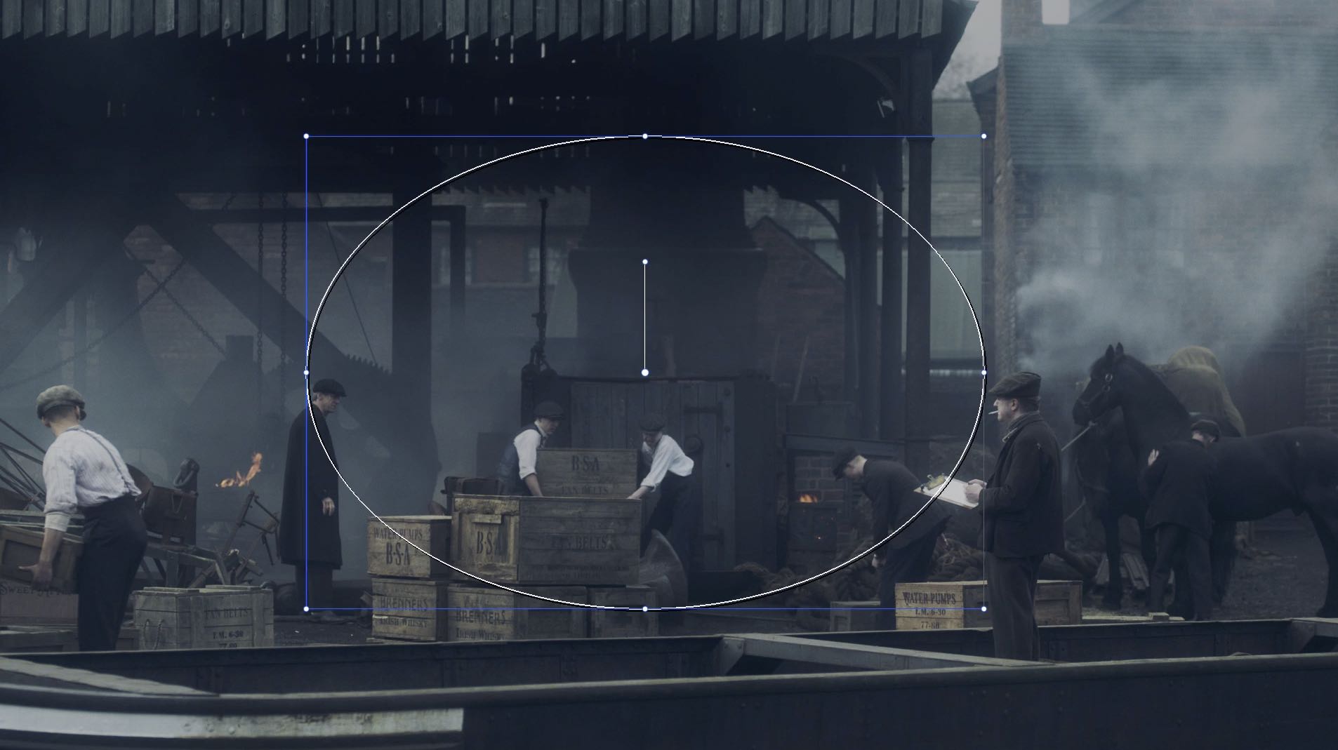
Other posts, like Simone Grattarola’s detailed dissection of his beautiful work on Peaky Blinders features some nice grading breakdown videos too – although these could have benefited with the addition of a little audio commentary.
Further content will be added on a monthly basis and there’s a lot more in the works, as the site has only been live for a few months.
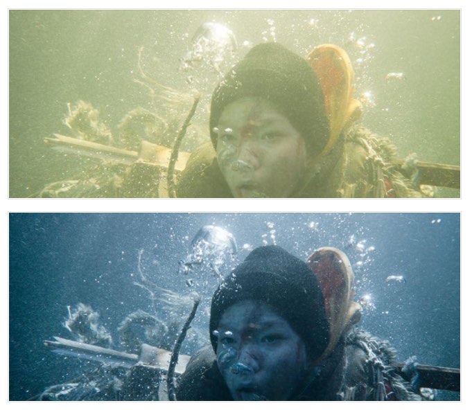
Tips on grading underwater footage from Big Game.
All in all, Lowepost is a brilliant resource for working colorists, junior colorists and keenly interested editors looking to learn more about the professional level art and craft of colour grading.
There are useful take aways and insights in each of the case studies and because the focus is on the craft and artistry involved, rather than the wide range of grading systems used, there will be resonant ideas for everyone regardless of the particular system you happen to prefer.
Not to mention the access that the Premium membership will give you to the wider community of colorists to ask questions and benefit from their wisdom in the forums and private chat rooms.
At about $4 a month it’s pretty much a no brainer. Sign up at a Lowepost.com.
The Colorist Podcast
Colorist Josh Petok (formerly?) one of the coloristos (another great colorist podcast that seems to have hit a hiatus – check that out here) has launched his own new podcast – the coloristpodcast.com, which is currently on episode 4.
What’s great about the series so far is that each podcast, pretty much, tackles a different subject matter with each interviewee. This makes all four episodes well worth a listen as it’s not simply re-hashing the same ground each time.
Sure there will no doubt be overlap as the series progresses, but the benefit of that is hearing a variety of different colorist’s experiences and opinions.
Mark Todd Osbourne (yes him, again!) shares some valuable insights on working as a freelance colorist in episode 4 (embedded above). It’s interesting to hear how deliberate he is at tackling as many different ‘genres’ as a possible to prevent himself from being pigeon-holed as the ‘features guy’.
He’ll even ensure that he has a variety of examples of work in sub-genres such as food commercials that feature a drink pour, or ‘making lettuce look edible’ to stop himself becoming known as ‘the red car in the desert commercial guy’.
They get into a whole variety of topics, including defending your rate, the impact that the ‘free DaVinci Resolve’ revolution has made, and the difference between a colorist who is genuinely talented and ‘just OK’.
Episode 003 features an in-depth conversation with colorist Gray Marshall on the topic of VFX which draws upon Gray’s extensive VFX background. They get into some of the following topics:
- When VFX should be done by a colorist
- Working in Lustre and why colorists don’t use a panel with it
- Should grading be completed before or after a visual effects shot
- Comparing tools in colour and VFX
The discussion about Lustre and some of the other common colour grading tools (Baselight, Pablo Rio, DaVinci Resolve) also leads to an interesting chat about the use of panels vs tablets and keyboards. Well worth a listen!
To see Technicolor Senior Colorist Steve Scott at work, check out his presentation (above) for Lustre from this epic round up on the making of The Revenant.